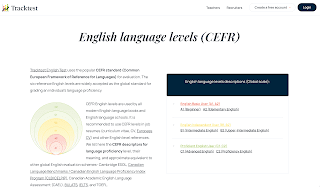
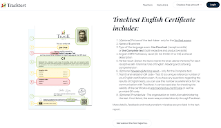
We launched our presentation webpage's new design (located at tracktest.eu) on February 14. It is the third website design iteration in our history, coming seven years after the previous "blue" redesign.
We wanted a new design to reinforce Tracktest's brand identity. Therefore you will find the elements and vibrant colors from our logo (red, yellow, and green) used in various contexts around the website. We are reducing the blue parts in the header and footer and replacing them with a more pleasing white or light blue background.
But this redesign is not only about the colors. We also make the new pages faster to load and easy to use on mobile devices.
With the new visuals of presentation webpages, we are entering the third stage of redesigning our brand identity. We updated the offline materials at the end of last year and the social media presence in January.
The last, most important, and complex phase- a visual refresh of the assessment application itself (app.tracktest.eu)- is coming next, and it is expected in the Q2 timeframe.


